Dark mode - Why it could be a better choice for your next web venture
July 7, 2022 | Jake_The_Human
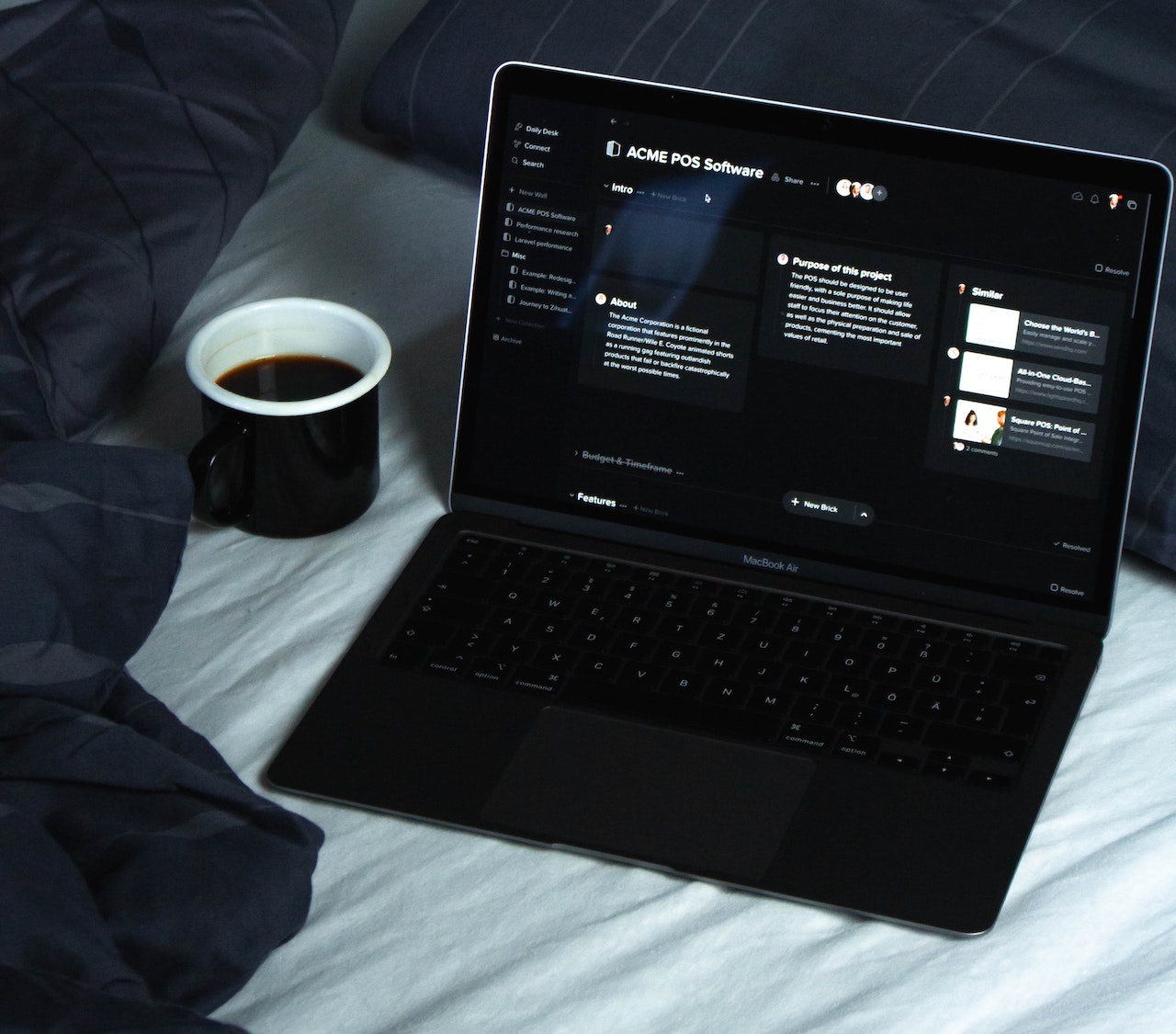
Among other trends in the web and tech world, dark mode nad generally websites using a dark theme is one of the most prominent. While there are many resources on why you should create a dark colour mode for your website and or app, I’d like to explore the idea of it being the main color choice, or even the only one, in your web app.

Pros of dark mode to consider it when making your web app
- Information, when displayed on a dark background is much faster precieved the on a light one, so for example if your app incorporates many graphs, text that is not meant to be read in detail, or moving parts it can be very beneficial to make the background dark.
- In modern day a lot of people, especial young people tend to prefer dark mode, be it for comfort or the “cool” factor.
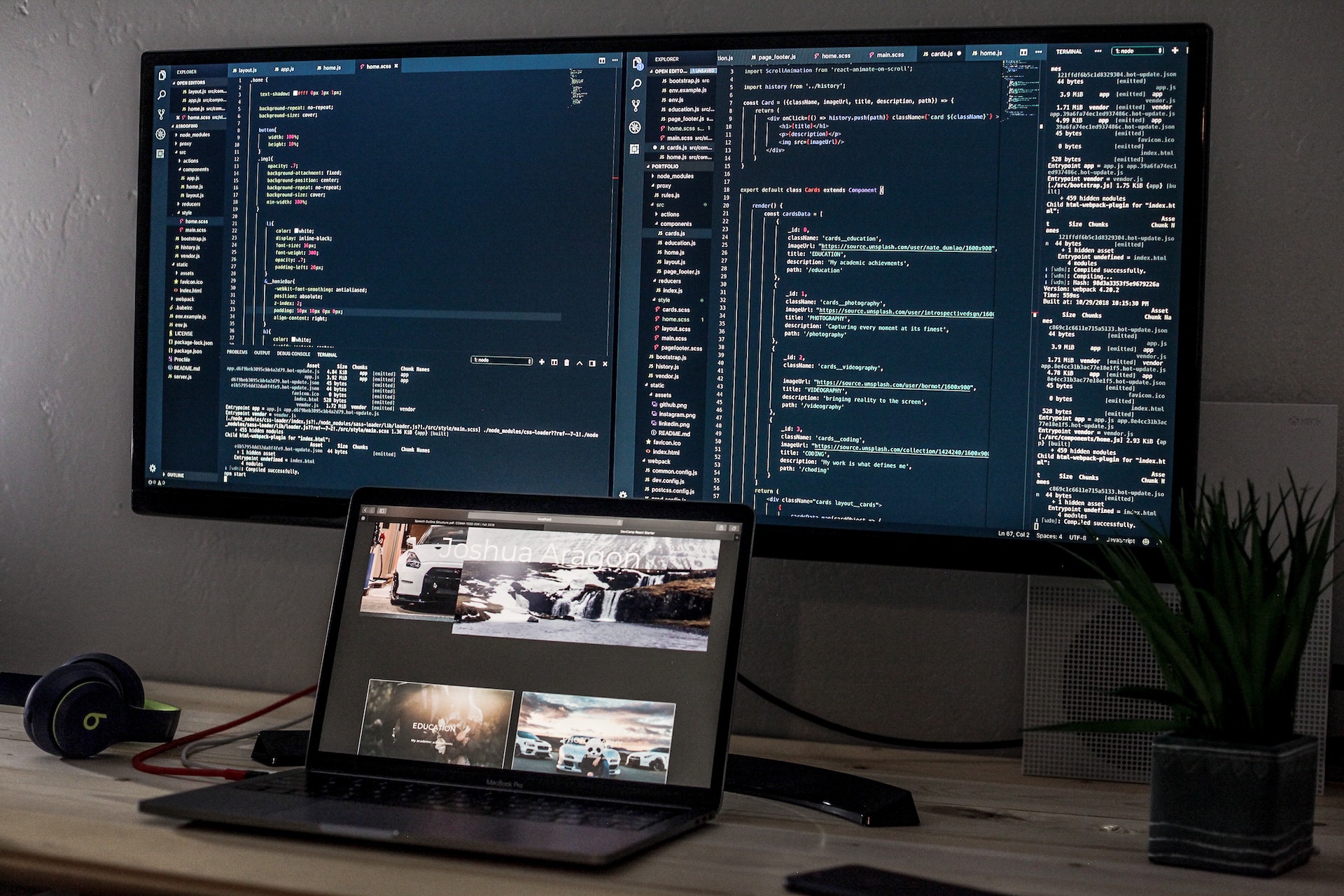
- If, for example your website is planing to reach developers, (who tend to live in dark mode) it may be beneficial to not burn their eyes out with it.
- Dark backgrounds save battery and save the planet.
- As a designer or developer, even if you want to make your website or app mainly light mode, It’s still a good idea to dark mode, or even height contrast mode, for people that have impaired vision.
But with all of these pros there also come…
The cons
- While taking in small bits of information is faster in dark mode, reading larger pieces of text that you might need to concentrate on will be slower, and produce a lot of eye strain.
- If the themes you are trying to convey are meant to be light and happy, you might have trouble conveying that to the user when using dark mode.
- Colour behaves differently on dark backgrounds, so it must be used more sparingly as it stands out from the backdrop a lot more heavily

Conclusion
As a general rule, I think it’s best to make websites that have both light and dark mode, to give people freedom of choice and to improve accessibility. but if you particularly don’t want to have a theme switch as an option, its important to consider the use of your website, the aesthetic you are trying to convey, and the stories you are trying to tell. In this situation, it might also be a good idea to consider doing a mixed UI, for example if you are creating an email app, making the background of the category section dark would improve the users ability to quickly scan and find what they are looking for, but then also making the main email section be on a light backdrop to lower eyestrain when reading the emails themselves, as they, in most cases, require more concentration.
References
[1] “When to Use White Text on a Dark Background” - April 28, 2011
[2] “We asked, you told us: Just about everyone uses dark mode” - March 7, 2020
[3] “Is Dark Mode Actually Better Than Light Mode?" - January 7, 2021